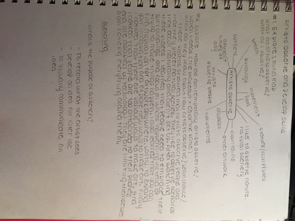
#1 explore mindmap
#2 explore: how do contemporary artists observe?
#2 explore: how do contemporary artists observe?
#3 develop skills: timed sketching
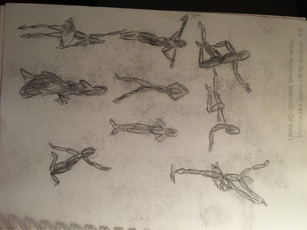
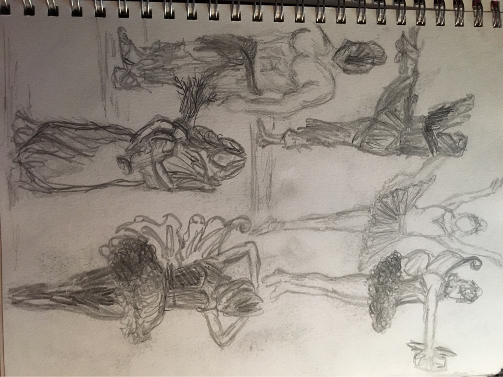
these are the sketching exceed uses that we had to do (the 30 min class online) I really liked this because it helped me focus on noticing shadows and trying to sketch the shapes as best I could in such short time.
#4 develop skills: shade a sphere
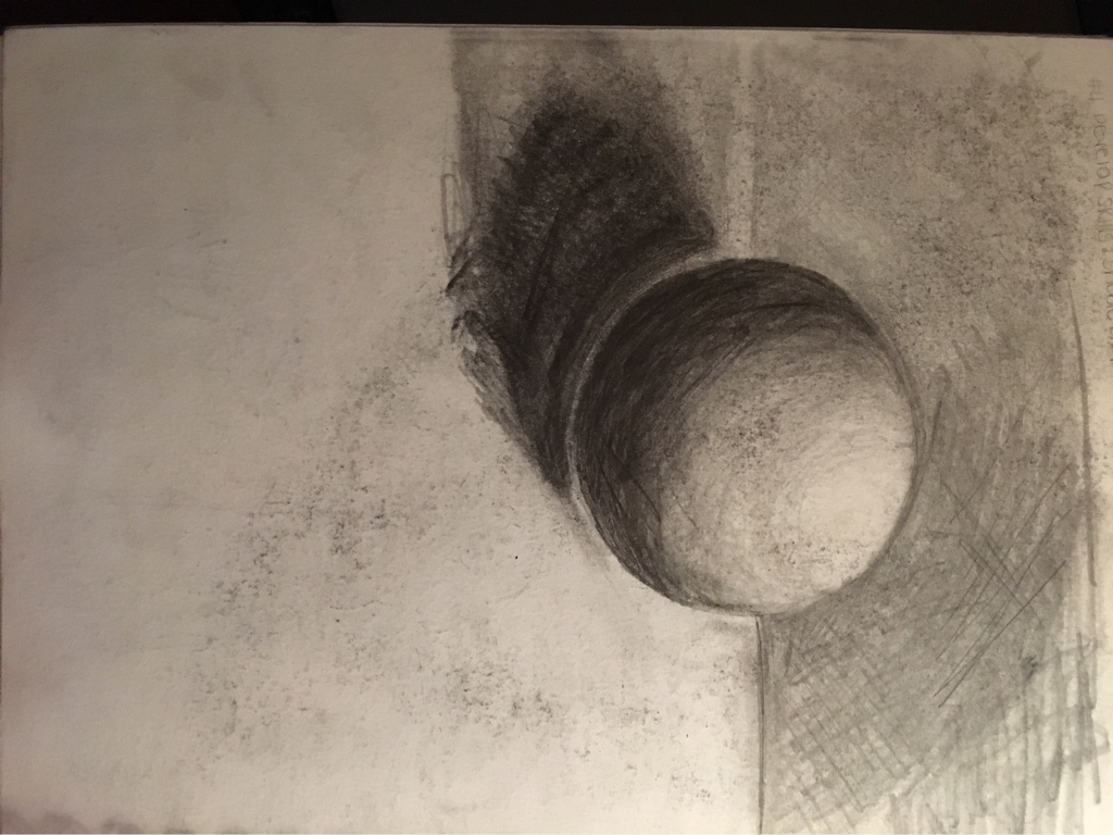
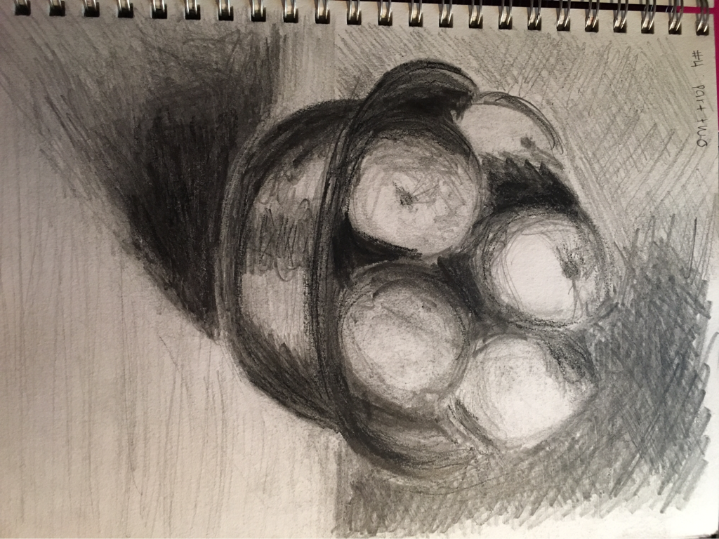
these are the value study exercise that we had to complete. I thought these were a little difficult because it was hard not using a tortillion or my finger to smudge and get values. Instead, I pushed myself to try different techniques like crossing my lines to get depose value and depth. Even though it was an assignment I struggled with, I enjoyed it because it helped me get better.
#5 explore:famous artists observe part1
#5 develop skills: artists observe part2
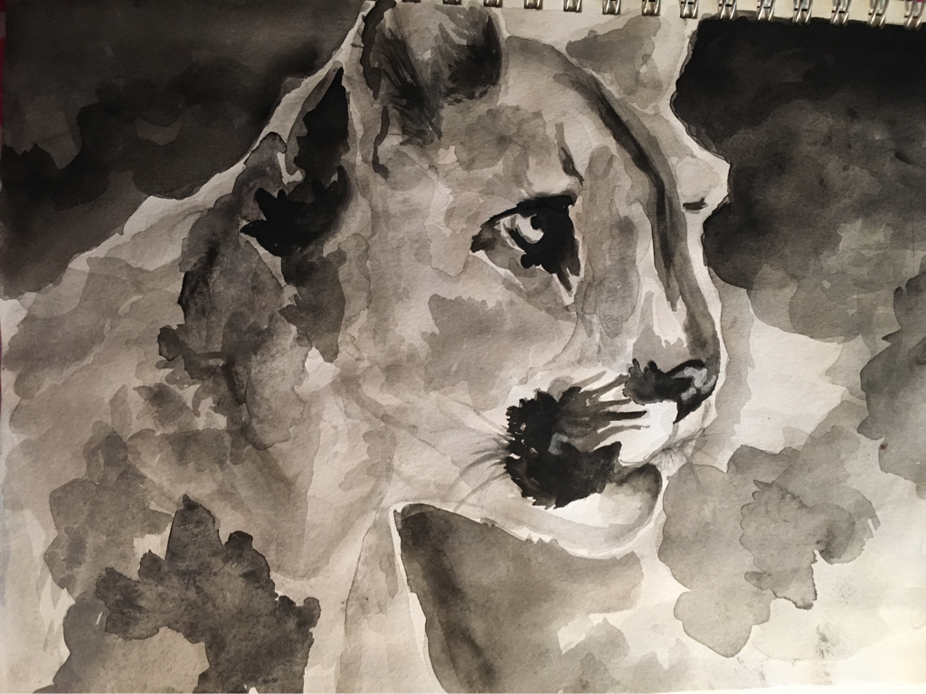
this is the assignment that we had to create your own version of an artist artwork. I choose Robert Bateman. I choose Robert Bateman because his work was inspired by nature and animals and I thought that his artwork would be really good to learn from because he's focusing on natural things, and all his inspiration comes from why's around him. I choose this price to recreate becaise his was originally just a black and white sketch of a puma. I figured it would be cool to change it a little and use paint. I have recently been experimenting with watercolor so I choose to recreate this piece using black water color only
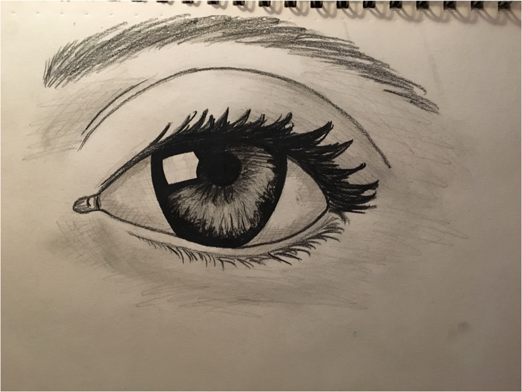
#6 challenges: choose one: option 1 realistic eye
#7 Your Turn
For the end of this portion, I choose to recreate a piece I never finished last year. I love nature, which is why I choose to recreate Robert batemans artwork. and his artwork actually inspired me to go back and recreate the painting of a red macaw. I think it's fare to say that I am mainly inspired by nature and whats around me when I draw or paint or sketch. So i figured this was a great time to express where my inspiration for art comes from. At first, I had no idea what to do with what was in front of me. I was so focused on trying to make it look as realistic as possible and I was so tied ti the idea of it having to be perfect. But after awhile i figured i should try something different and take a risk. so i changed the leaves in the background and made them more cartoon like by using abrupt brush strokes and mixing a variety of shades of green and brown. after that i repeatedly changed the feathers on the head and the tail feathers. instead of following the traditional red, blue, and yellows, i mixed in purple and ark blues along with white to give it a fun feeling. even though i do feel as though i struggled with this piece, i think it was a great opportunity to take risks and learn. as well as letting go and accepting what i have created. in the end i would say i am happy with what i made.
Unit one mainly focused on developing different skills such as shading, sketching, and perfecting the skills that we already had. The artist that I choose from this section is Robert Bateman. His artwork is nature based and he paints lots of birds and sometimes underwater animals along with buffalo. In the past he has experimented with many different styles of art but now he is mainly famous for his realist paintings and paintings of animals and nature. I choose to study his artwork because I love nature and I think that nature is a perfect way to get inspired. Also, in nature there is no pretending and there isn't a right or wrong way to take in whatever you see. For my artwork I decided to pick a bird and paint it. I decided to paint a red macaw and try to make it look realistic but also have an abstract feel to it.
For the sketching part of this unit, I completed the 30 minute online sketching class. At first i really struggled with this because I felt like I didn't have enough time for each model and I kept feeling the need to pause each one so I could create a detailed sketch of everything. But then I understood that the purpose of this was to develop sketching skills and be able to draw something quickly so that you have an idea of what you want to do and you can later on go back and develop it into a greater piece of artwork.
During the value part of this assignment, I found myself getting pretty frustrated because it was very difficult to not use the tortillian and try and use skills like cross sketching and lines instead of smudging to blend. Also, it was kind of difficult because I wanted my sphere to look just like the tutorial. Lastly, when i went to draw the bowl of fruit on my table, It was really hard to make it look like fruit and it ended up resembling a bowl of ice cream.
Unit 2 artist create original art
#1 Contemporary artists steal
#1 Contemporary artists steal
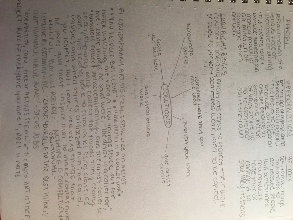
#2 develop: what is fare use?
#3 The College Board on Ethics, Artistic Integrity and Plagiarism
#4 explore: Artists Who Steal
#5 develop: Challenges!
#6 explore: Brainstorm
#7 Create Original Art!
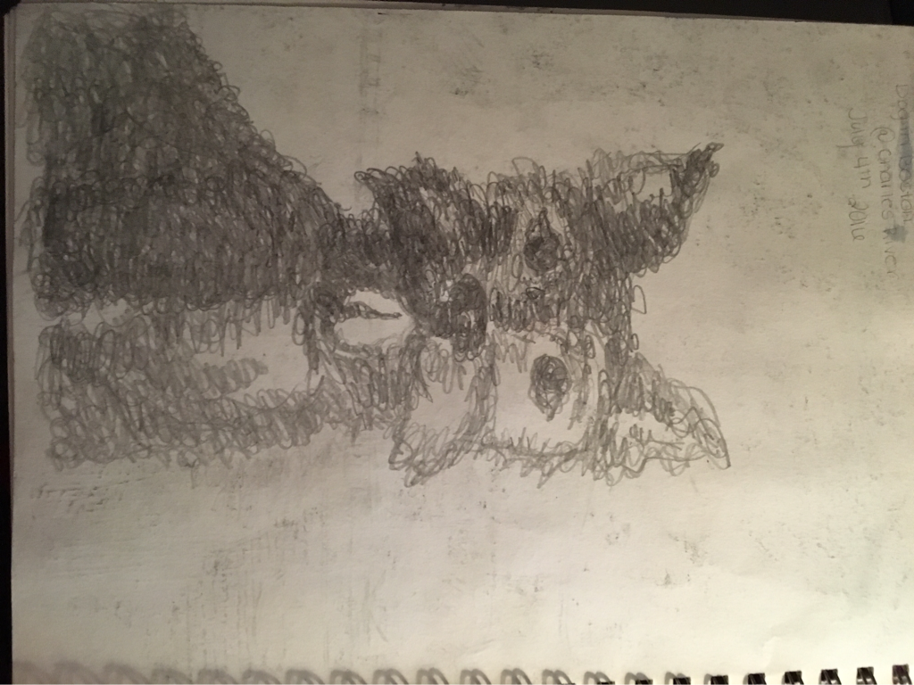
This is a sketch of a dog on the Fourth of July at the fireworks in Boston. I loved making this because it was different and something i havent done before. wile creating this, I didn't lift up my pencil or erase anything. I also used swirls and squiggles to create shapes and textures along with trying to create shading. (Pencil)
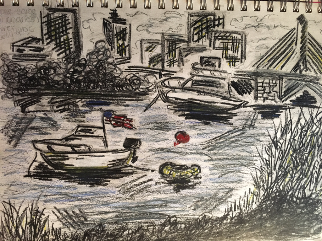
quick sketch of where I was sitting to watch the fireworks in the Fourth of July in Boston. (Pencil, graphite, and colored pencil)
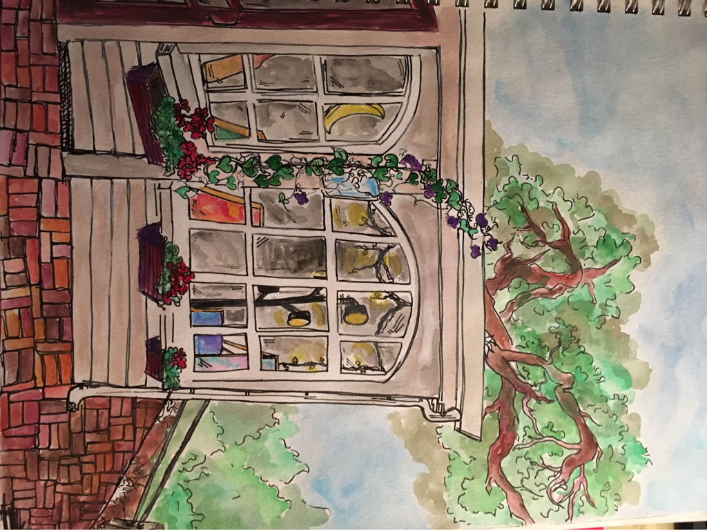
throughout the summer I went to various coffee shops and each time i brought my sketchbook so i could get pictures and later make a more completed piece when i got home. corner cafe in marshfield, water color)
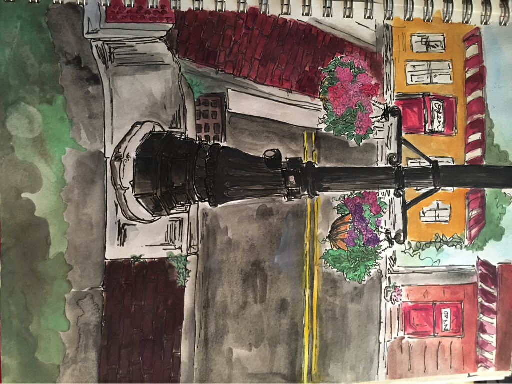
throughout the summer I went to various coffee shops and each time i brought my sketchbook so i could get pictures and later make a more completed piece when i got home. (homestead coffee shop in dorchester, watercolor)
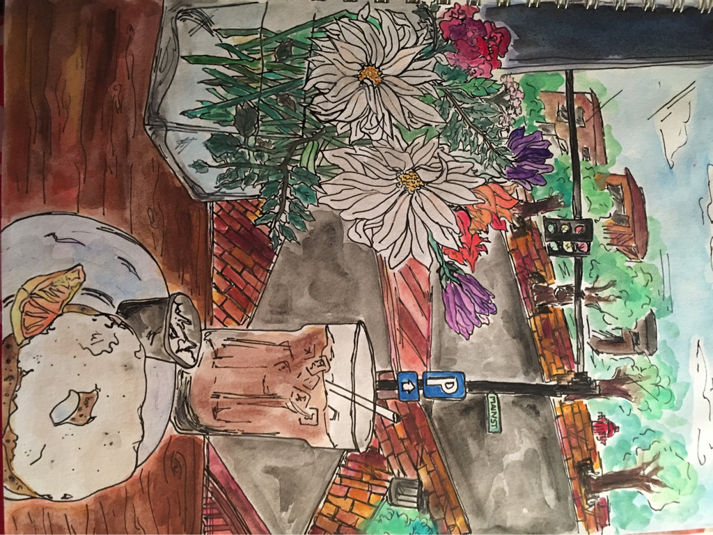
throughout the summer I went to various coffee shops and each time i brought my sketchbook so i could get pictures and later make a more completed piece when i got home. (coffee shop in holliston, watercolor)
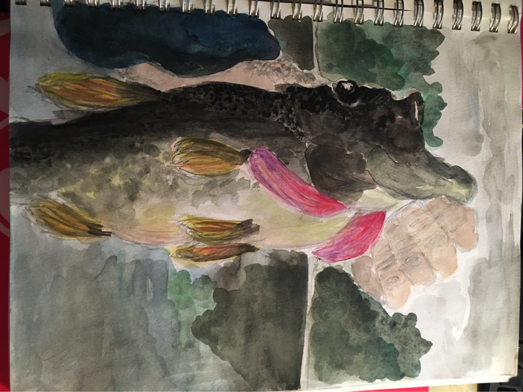
I also went to new Hampshire over the summer and brought my sketchbook as well and experimented a little more with water color. I really enjoyed this piece and I am also very proud with the way it turned out. I tired my best to make it look as realistic as possible but also so you could see the texture in the fish. It was really hard to figure out a way to make the scales on the fish without it looking to fake or becoming over powering but in the end I was pretty content with the way they turned out. Lastly, I kind of liked how my pencil sketches are still visible through the watercolor. (large mouth bass that I caught in New Hampshire (watercolor)
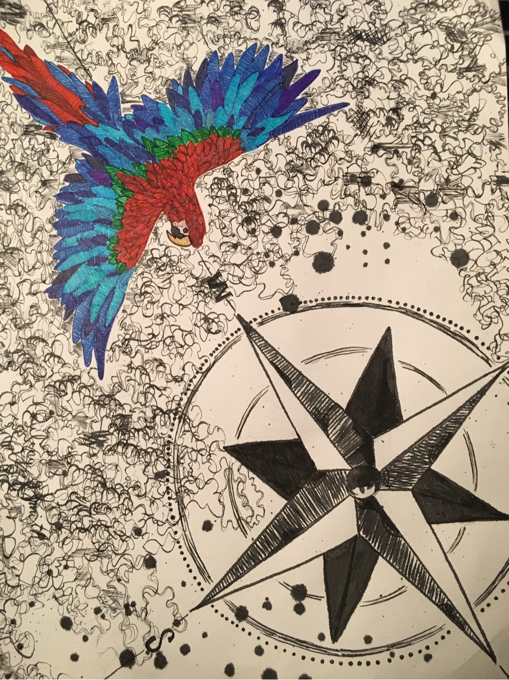
This is my future self project. I chose to work with pen and ink to create the trees and make them look kind of like squiggles. I also used pen and ink to create the compass rose. For the parrot, I used fine tip marker pens. The compass rose symbolizes how I want to travel the world and explore new places. For example, I want to go to the rainforest which is why I chose a parrot native to the rainforests in Brasil.
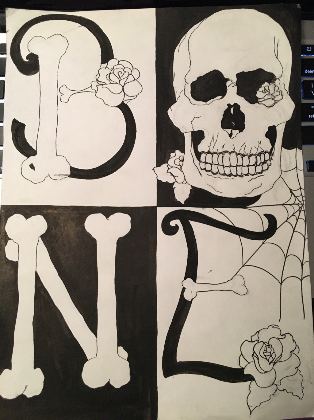
This is my work in progress for my graphic four letters. I chose the word bone, and decided to use pen and ink for everything. Also, i plan on using red glitter for the roses to add a focus point and unite all of the letters together. I filled the background of two of the squares opposite each other to provide contrast as well.
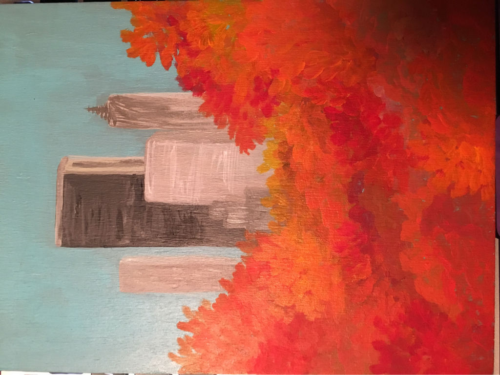
Progress image for my New Yorker project. I chose to do a fall theme instead of spring as shown in the original. Also, I tried to make it so it looks like a zoomed in version of the cover.
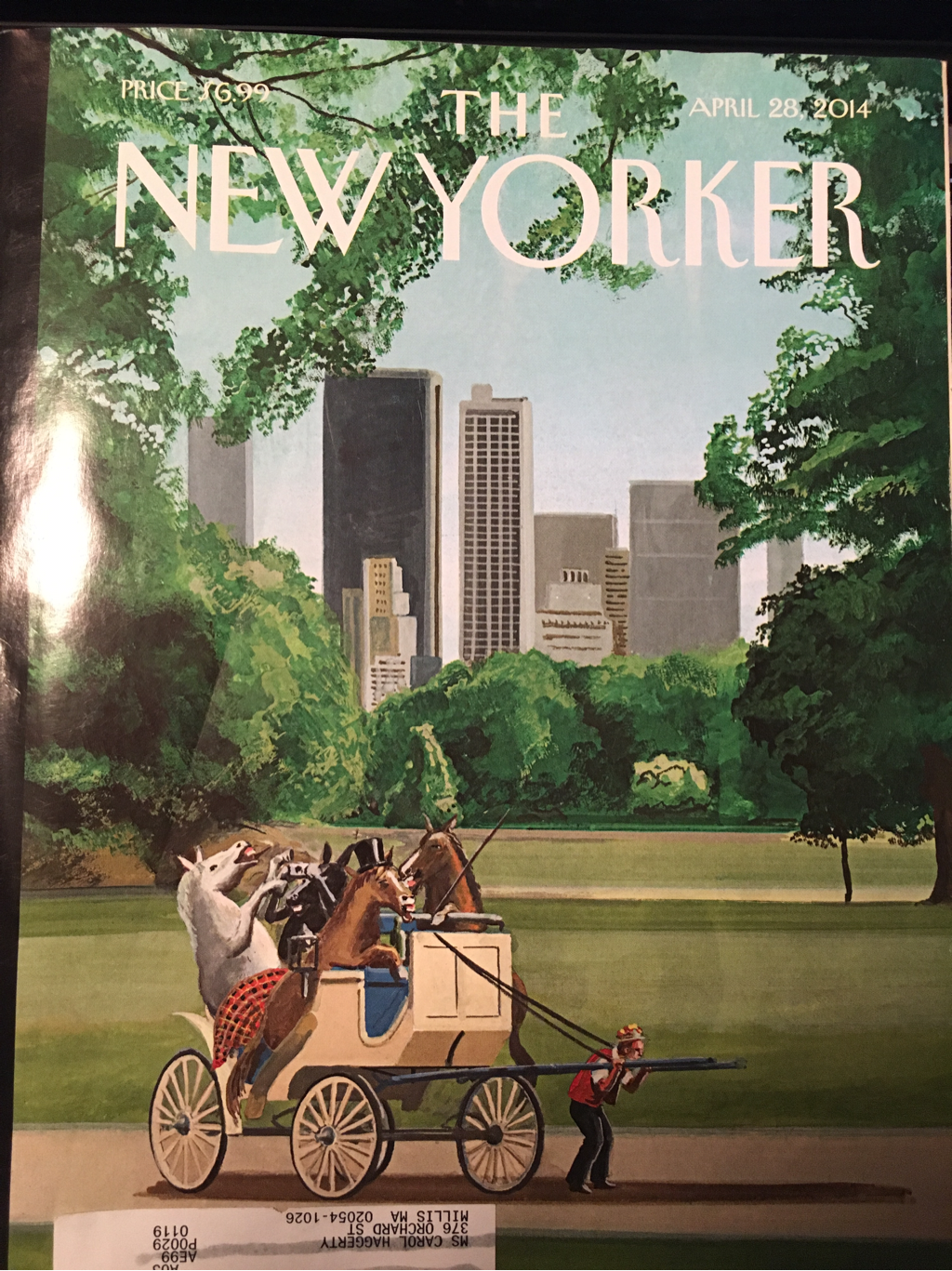
The artist who designed the cover of my inspiration is bruce mcall (inspiration for new york cover). Bruce Mcall was fascinated by comic books and from an early age was interested in drawing flying machines, blimps, bulbous-nosed muscle cars and futuristic images. He was never involved in physical activity but always found ways to evolve his creativity. He began hi s artistic career by drawing illustrations for Ford Motor Company in the 1950's. He worked in the advertising industry for decades then turned to publishing. He has been doing images for the New Yorker since 1978, and various other magazines.
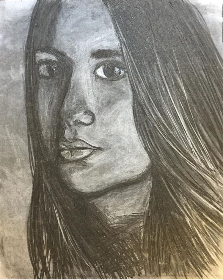
This is my charcoal self portrait. To create this, I experienced with various different techniques. I attempted cross hatching, along with using an eraser to create highlights to show value. Also, compared to other students in my class, I used dark line values rather than light charcoal marks. I struggled with this piece and it took me awhile to get the proportions to look okay but overall I am content with the outcome.
